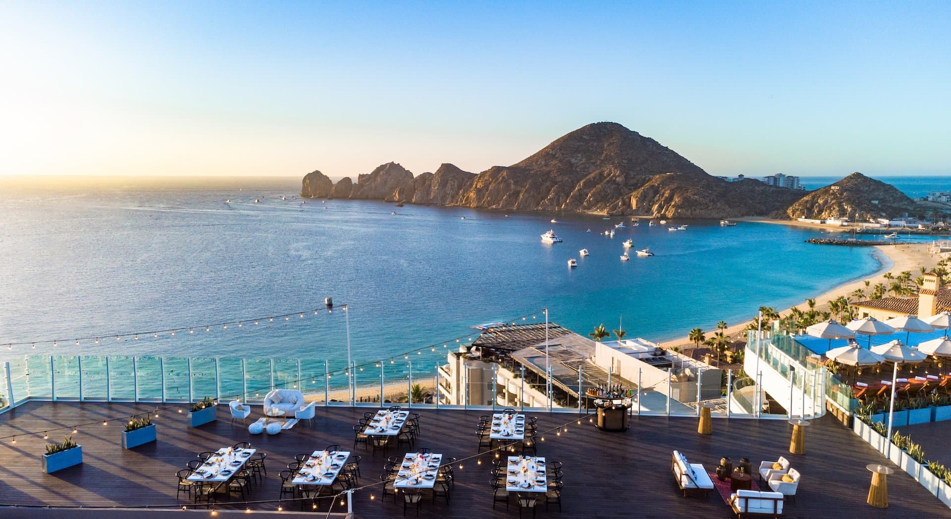
What is this “contrast design,” a term commonly tossed around to describe the preferred look and feel of Noble House hotels? We demonstrate through this collection of products.
A
t its most basic, the principles of contrast design boils down to purposefully bringing together two dissimilar elements – black and white, new and old, rough and smooth.
But it can be translated in an innumerable variety of items and settings, explains Scott Colee, chief creative director for Noble House who manages architectural and interior design for each property and outlet. For example, contrast in design is very much on display at Florida’s Little Palm Island Resort & Spa, where rough castaway-style, thatch-roof bungalows are dripping floor to ceiling in sleek elements of crystal chandeliers, copper tubs, and white table linens. Or it can be dialed down to just smaller decorative elements, like in Seattle’s The Edgewater Hotel with its “robo-trees” – real wooden tree limbs attached to stainless-steel tree trunks via hardware.
So while the idea that “opposites attract” isn’t novel by any means, when taking it to the diverse degrees that Noble House has in its properties through contrast design, that’s when you get interesting, compelling, and attention-holding design and ambience – and precisely what you’ll see demonstrated in these following product examples.
Foucault’s Orb [Restoration Hardware]
This stunning chandelier is inspired by nineteenth-century experimental physicist Léon Foucault’s gyroscope design, then blended with modern lighting and precision-cut, polished crystal.
ES3 Espresso Machine [Strietman]
A high-tech look is married with very simple brewing engineering from the 1950s (a simple robust lever is all that is needed to give you the extraction of you perfect espresso) in this sleek, modern coffee machine.
Egg Surfboard [Octovo-Tilley]
Made with Port Orford cedar from Oregon, this handcrafted log’s natural look is given a sleek edge with a slick black “dipped-look” paint job and titanium leash cup.